
Freelance Graphic Designer
Logo Design
Every business, and some people, need an icon or image to set themselves apart from the crowd with just a single glance.
Website Design
A website is your billoard to the world. Great design and informative content will set you apart from your competition.
Book Design
Despite the warnings of that old adage, people do judge a book by its cover. Better make it a work of art.
Business Card Design
Often, Business Cards are the first glimpse a prospective client gets of your business. Make that first impression count.
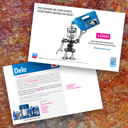
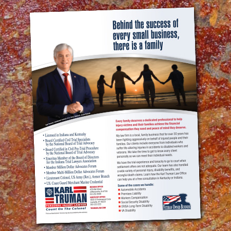
Direct Mail Design
Direct Mail is still a valuable way to get your message in the hands of a targeted audience. Great design makes that message clear.
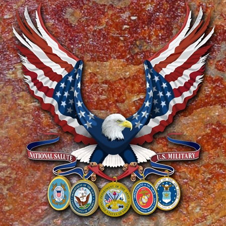
Illustration
Illustration can take the place of product photography at a fraction of the cost. Sometimes it’s the easiest way to show how something works.
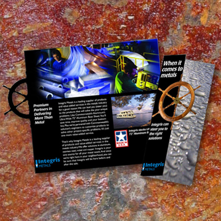
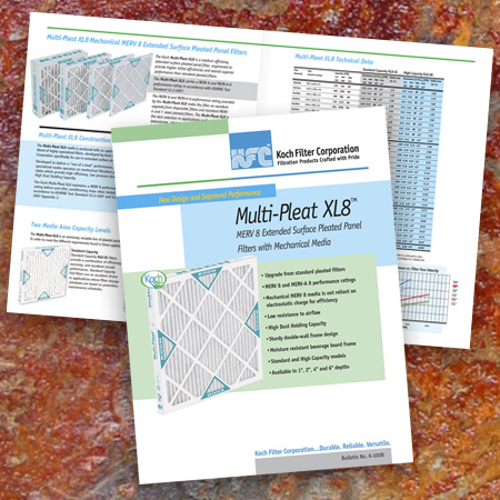
Brochure Design
Brochures are an effective way to highlight a product or service. Great Design can show your customer important details about your product.
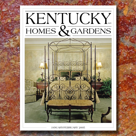
Magazine Design
Magazine Design requires a balance of information and imagery to tell a story. Alfred Moreschi has been responsible for the production of both local and national magazines.
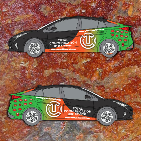
Car Wrap Design
Put your actual valuable text here, this is only a dummy text. Fortune salutes the brave, We are brave, we are fearless.
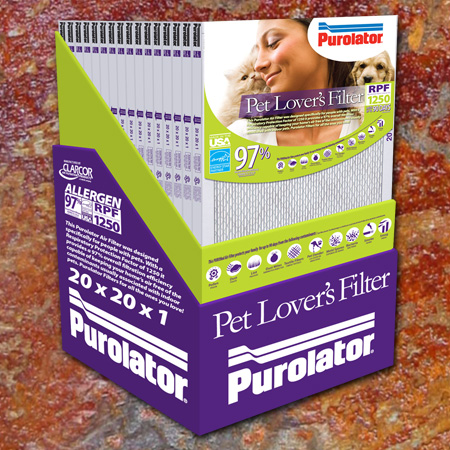
Package Design
Package Design requires working within the limitations of the physical elements to create an aesthetically pleasing appearance that attracts customers.
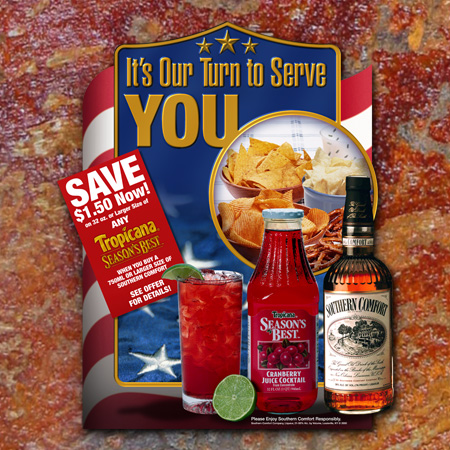
Point-Of-Purchase Design
Effective Point-of-Purchase Design is critical to attract customers like flowers attract bees to the pollen. Great Design sells products.
Catalog Design
Catalogs are needed to list your products. There’s no reason why they can’t be designed to be both organized and pleasing to the senses. Great Design makes things easier to purchase.
Poster Design
Posters are effective at promoting musical shows or other artistic ventures. Beautiful imagery can tell the story quickly.
Advertisement Design
Advertiements in newspapers or magazines allows you to reach a wide variety of potential customers. Great design is important to make your message stand out in the crowd.
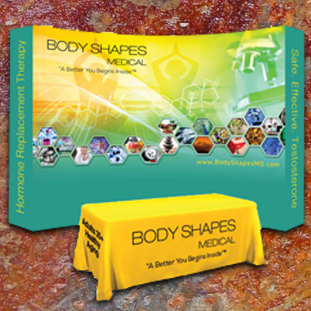
Expo Display Design
Expo Displays are small billboards that highlight your company’s image while in a sea of competition. Great Design makes you stand out in the crowd and tells your story to the world.
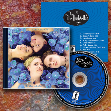
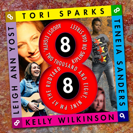
CD Package Design
CD Package Design is where I have found the most joy. Creating beautiful imagery to represent wonderful music is the highlight of Great Design.
Welcome to Alfred Moreschi Graphic Design!
Alfred Moreschi’s Designs and Marketing Materials have helped a wide range of clients raise awareness, stimulate sales and convert prospects to customers. MORESCHI’s client experience ranges from Fortune 100 to large B2B manufacturers, B2C industries including entertainment, healthcare and retail. Entrepreneurial and young companies value the personal attention and quick results from MORESCHI. From digital communications—websites, social networking, newsletter, and digital marketing—to brand image and logo development—to brochures, product catalogues and book designs—MORESCHI produces. When a team approach is needed, MORESCHI brings more resources to the work like writers, strategic planners, event planners, printers, and more.
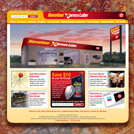
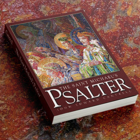
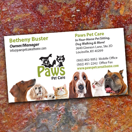
Recent Designs by Alfred Moreschi


From The Blog
Leave Your Mark On Everything You Do
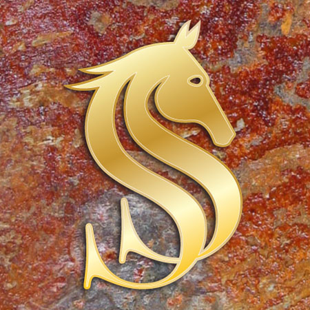
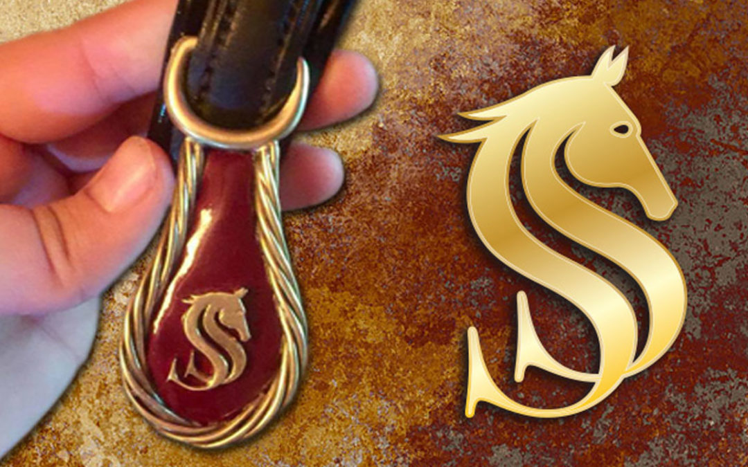
I recently designed a logo for Susan Swope who wanted something to distinguish and identify her ownership of saddlebred horses. It needed to be something simple enough to work into brass to apply to her horse’s harness and saddlery. When I was working out some ideas I couldn’t help but notice that the double “S” looked a lot like the majestic pose of the saddlebred. I flipped the letters over to accentuate the proper angles then added the head. It all flowed together perfectly. To top it off I added a couple strokes to represent a mane and balance out the whole thing. I was very happy with the results and was even more excited when Susan sent me pictures of the tackle with the logo elegantly applied. Beautiful!! Do you have a need for a logo to apply to an unusual application? Let me help!

Contact Alfred Moreschi
alfred@moreschi.biz
(502) 894-0937